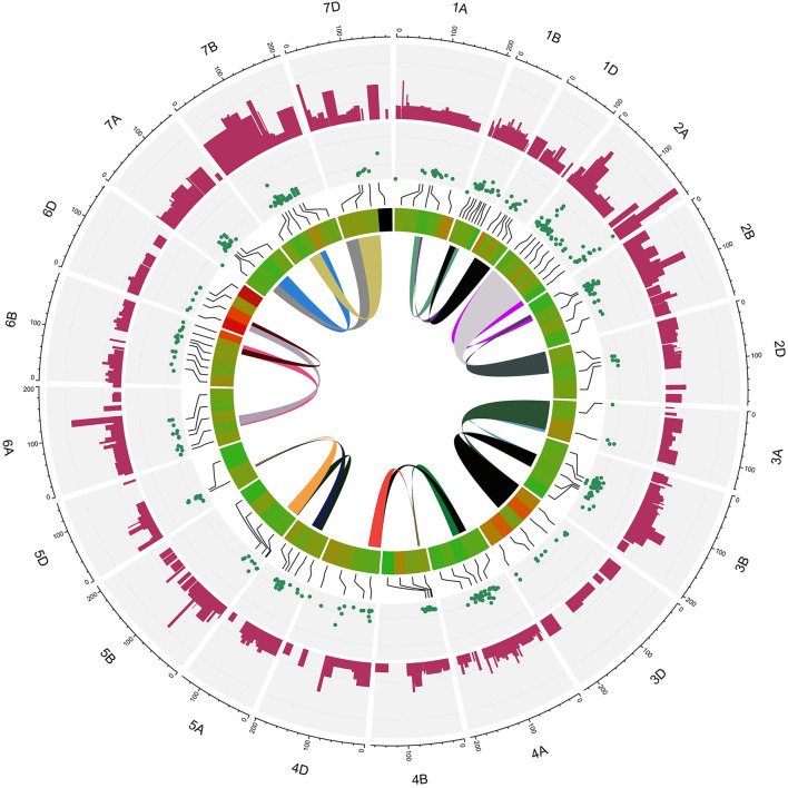
Figure 5.
Circus plot showing distribution of QTLs and MQTLs on 21 linkage group of wheat. The outermost circle indicates the length of each linkage map on the consensus genetic map. The second circle indicates the initial QTLs with 95% confidence intervals. The third circle displays the density of QTLs in each MQTLs. The fourth circle displays the position of detected MQTL related to assessed traits based on heatmap illustration. The last inner circle demonstrated common markers links between different genome (A, B, and D) of each linkage groups.

