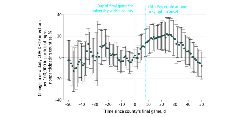
Figure. Difference in New Daily COVID-19 Infections per 100 000 in Counties With Universities Participating in March Madness vs Counties Without Universities Participating in the Tournament.
Graph shows difference in COVID-19 rates per 100 000 individuals in counties with a university participating in the NCAA Men’s Division I Basketball Tournament (March Madness) from January 28, 2021, to May 25, 2021, compared with the control group of nonparticipating counties within the same states. Both the participating and nonparticipating counties had decreasing COVID-19 rates during this time period. Thus, this figure displays the slowing of the decline in participating counties and brief increases in infections, compared with nonparticipating counties. The 75th percentile of time to symptom onset was 8 days. The 95% CIs are represented by the error bars, and the dots denote point estimates. Estimates come from a difference-in-differences event study model. This model includes county indicators to adjust for time-invariant differences across counties, as well as week-of-year indicators to adjust for changes in COVID-19 infections that varied across time but did not vary across counties. Robust SEs were clustered at the state level. The outcome variable was normalized with a log-transformation. The preperiod estimates are all insignificant, meaning that the parallel pretrends assumption was satisfied. Please see the eAppendix in the Supplement for more details.

