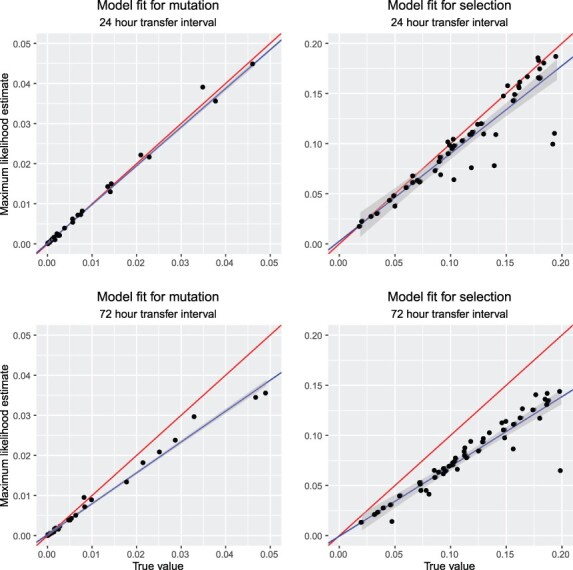
Figure 3.

Comparisons of parameter estimates with true values using simulated data: effect of carrying capacity. The first row shows cases with transfers every 24 h, for which the population was always well below carrying capacity. On average, the estimates closely match the true values, with a best fit equation of  for mutation and
  for selection. The second row analyzes cases where transfers occur every 72 h, for which the population is mostly growing non-exponentially because of its approach to carrying capacity. The estimates are now substantially biased downward, with a best fit equation of
  for mutation and
  for selection. The red line indicates the 1:1 fit expected if the maximum likelihood method worked perfectly, whereas the blue line is the realized fit, with its 95% confidence interval in gray.
