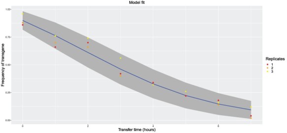
Figure 4.

Graphical output of analysis software MuSe for the model fit to the data. Data are shown as colored dots; the blue curve is the model curve; the gray region represents the 95% confidence interval for replicate transgene frequency measurements at each time point assuming the maximum likelihood estimates are true. Data used for this figure are the Generation 0 frequencies from (20) provided by E. Top (given in our Supplementary file).
