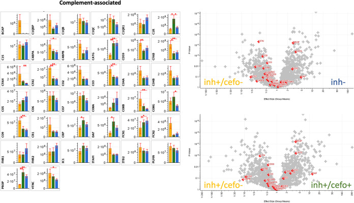
FIG 6.
Differential abundance of complement-associated proteins. The bar plot graphs and volcano plots highlight the relative abundances of all complement-associated proteins identified in the current sputum proteome data set. The bar plot graphs show the protein intensities (expressed as means ± SEM [error bars]) of the respective proteins. The yellow (inh+/cefo−), green (inh+/cefo+), and blue (inh−) bars refer to the sample groups identified with PLS, as shown in Fig. 1A. The volcano plots show all proteins with differential abundance in the different sample groups. The red plus signs refer to the complement-associated proteins, as detailed in the bar plots. P values and effect sizes for differential abundance of individual proteins are presented in Table S3. Asterisks mark P values of ≤0.05 (*) and ≤0.01 (**).

