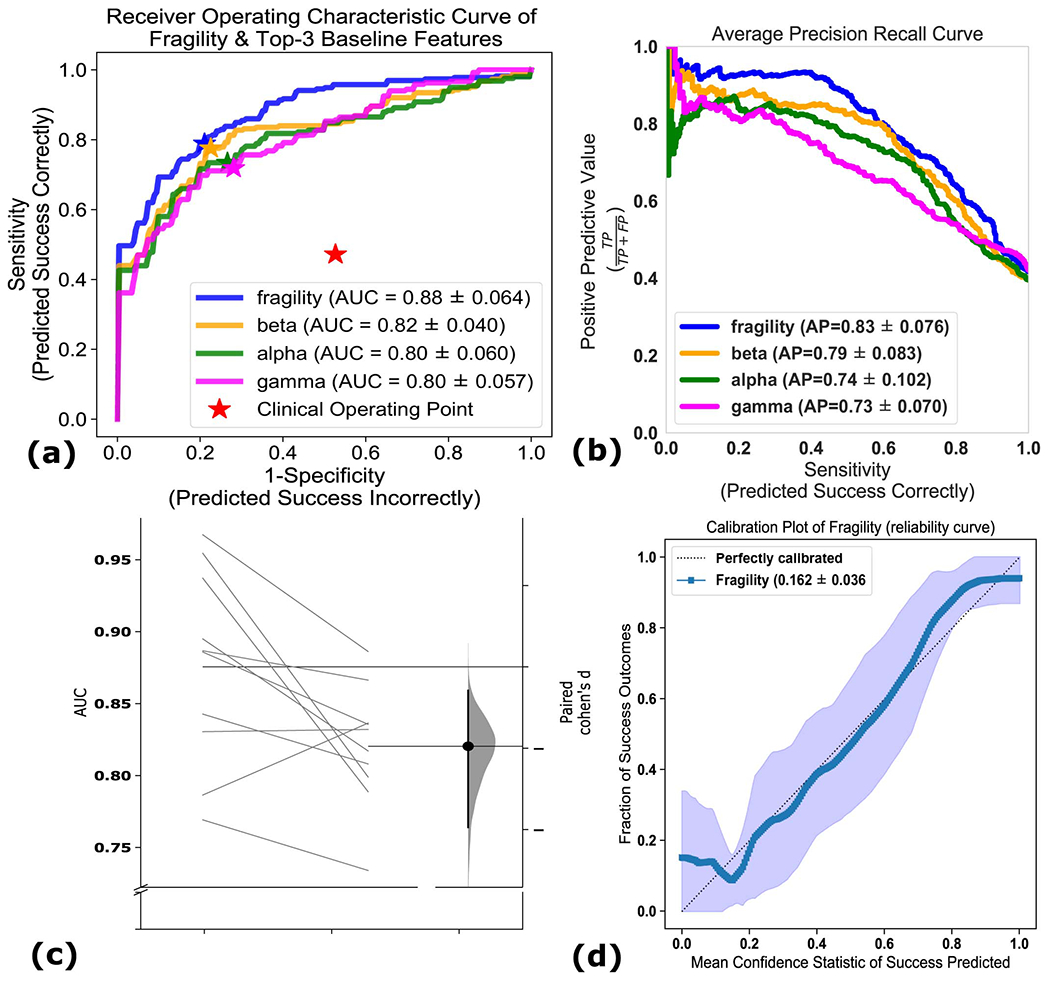
Extended Data Fig. 6. Comparison of classification models using different features.

Comparison of classification models using different features - (a) The ROC curve over 10 folds of cross-validation of the held-out test set obtained by applying a Random Forest model onto the spatiotemporal heatmaps to predict surgical outcome (see Methods). Fragility and the top-3 baseline features in terms of AUC are visualized. The shaded area represents the standard deviation of the curve obtained by linear interpolation for visualization purposes. The AUC of fragility obtained a 0.88 +/− 0.064 over the 10 standard deviation with a relative improvement of 7.2% improvement in AUC compared to the next best feature representation (i.e. the beta frequency band). At the Youden point (stars), neural fragility obtains a balanced accuracy score of 0.76 +/− 0.06, and an improvement of 0.32 in TPR and 0.32 in FPR compared to the clinical operating point (red star). (b) The average PR curve showing that fragility is better then the top 3 features by at least an average precision of 0.04. (c) A paired estimation plot showing how the same test set of patients differed in AUC depending on whether it was using the fragility, or beta feature heatmap representation. The paired Cohen’s D effect size was computed at −0.975 (−1.97 to −0.29; 95% CI). The p-values associated with the difference between Neural Fragility and the Beta frequency band were 0.0204, 0.0273, and 0.0225 using the one-sided Wilcoxon rank-sum test, permutation test, and the paired student t-test respectively. (d) Calibration curve showing the fraction of actual successful surgical outcomes on the y-axis vs the average CS output on the x-axis. The curve measures how calibrated the predicted success probability values are to the true risk stratification of the patient population. The closer a curve is to the y = x line, then the more calibrated a model is. It is quantified by the Brier-loss (closer to 0 is better), which is shown in the legend, and30 is significantly lower then the next best feature (an improvement of 15%). The shaded region represents 95% confidence interval of two standard deviations.
