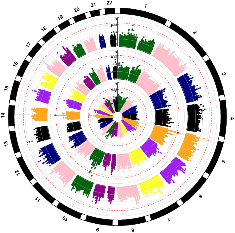
Fig. 3.
Circular Manhattan plot of SNP associations with disease related mortality. Chromosomes are numbered on the outside. p = 5 × 10⁻⁸ is marked with dashed red lines. Each SNP p value association with disease-related mortality is a colored dot, with genome-wide significant SNPs as red dots. Results are shown for recipient (outer circle), donor (middle circle) and donor-recipient mismatches (inner circle), respectively.

