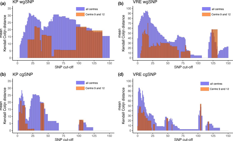
Fig. 3.
Sweep cut-off analysis results. The barplots in this figure illustrate the mean differences between the outbreak clusters reported among centres. For example, a distance of 0 means that centres reported identical outbreak clusters. The mean distance is calculated using the Kendall–Colijn distances metric. (a) Sweep cut-off analysis of the KP samples using the wgSNP method. (b) Sweep cut-off analysis of the VRE samples using the wgSNP method. (c) Sweep cut-off analysis of the KP samples using the cgSNP method. (d) sweep cut-off analysis of the VRE samples using the cgSNP method.

