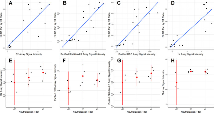
FIG 6.
Correlation of IVTT and purified protein microarray results with ELISA and virus neutralization assays. (A to D) The scatterplots show the SARS-CoV-2 S protein-based ELISA Pan Ig signal/threshold ratio (y axis) plotted against the protein microarray log2 normalized IgG signal intensity for S2 and N proteins produced in vitro, as well as for the stabilized, purified full-length S protein and the purified RBD fragment of S1 protein (x axis), respectively. The blue lines were fit to the data using linear regression. (E to H) The dot plots show individual values of each patient for the protein microarray log2 normalized IgG binding intensity (y axis) of the four proteins shown in panels A to D at each neutralization titer (x axis). Red dots are plotted at the means of each stratum, and the red lines represent the 95% confidence intervals.

