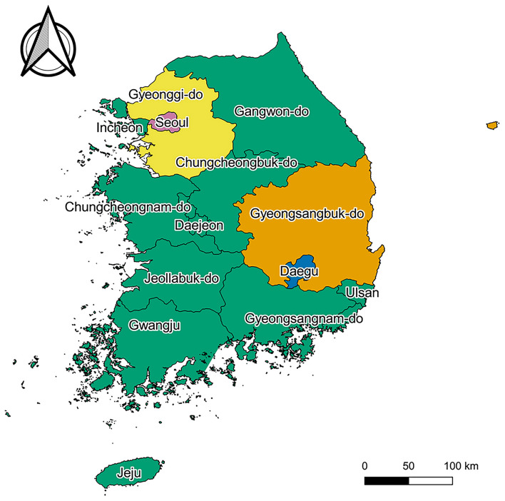
Figure 1.
Map of South Korea. Pink, yellow, blue, orange, and green regions represent “Seoul,” “Gyeonggi-do,” “Daegu,” “Gyeongsangbuk-do,” and “others,” respectively. Map created by Kim et al. (2021), using QGIS version 3.10.13 (QGIS Development Team, http://qgis.osgeo.org). The Shapefile used in this figure was obtained from “South Korea level 1” of GADM data version 3.6 (https://gadm.org/download_country_v3.html), the data to create maps for academic publishing is freely available (License suggested: https://gadm.org/license.html).

