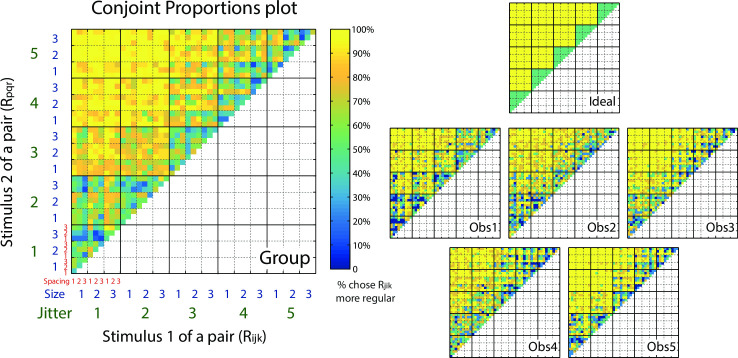
Fig 3. Conjoint Proportions Plot.
Plots showing pairwise comparison results for regularity judgments, for an ideal observer (right top), the five individual observers (right bottom) and their group average (left). The color scale of the pixels in the matrices represents the percentage of trials on which stimulus Rijk (absicassa) is judged more regular than stimulus Rpqr (ordinate). The data matrix for an ideal observer (right top) is plotted based on the difference of jitter only, and is uncontaminated by the effects of element spacing and element size. The group matrix (left) is calculated by averaging the response percentages across the five observers (right bottom). Element spacing is indicated by the smallest, red numerical labels 1–3. Element size is indicated by the blue numerical labels 1–3. The blocks in dotted lines represent different element size levels. Jitter level is indicated by the largest, green numerical labels 1–5. The blocks in solid lines represent different jitter levels.

