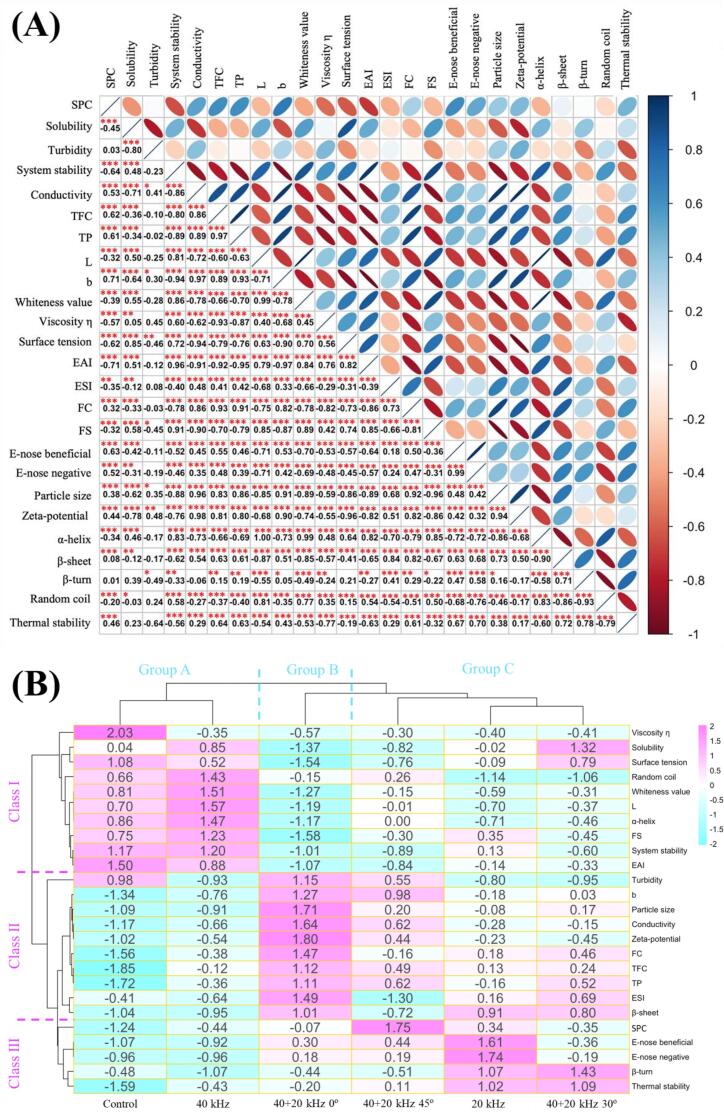
Fig. 6.
Analysis of correlation (A) and clustering heat map (B) between corresponding indexes of different ultrasonic treatments. Fig. 6A visualizes the correlation between color and ellipse size, with blue representing positive correlation and red representing negative correlation. The size and color intensity of the upper triangle ellipse are positively proportional to the correlation coefficient. The lower triangle represents the correlation coefficient, which is marked as significant (p < 0.05 (*), p < 0.01 (**), p < 0.001 (**)). In Fig. 6B, blue represents the lowest content, while red represents the highest content.

