. 2021 Oct 28;17(11):e10260. doi: 10.15252/msb.202110260

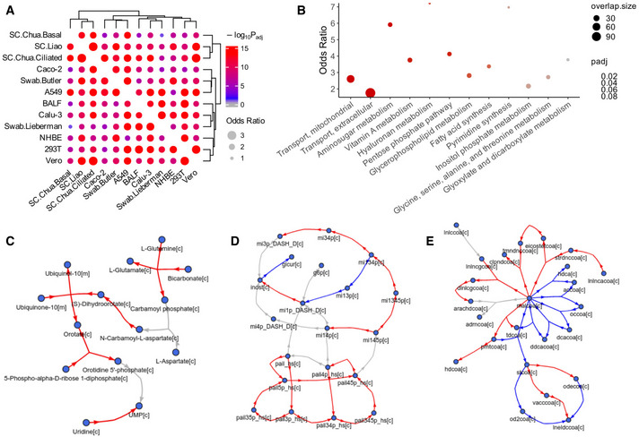
Figure 2. Genome‐scale metabolic modeling (GEM)‐based analysis of SARS‐CoV‐2‐induced metabolic alterations across datasets.

Figure 2

Genome‐scale metabolic modeling (GEM) was used to compute the metabolic fluxes from the gene expression profiles, and reactions with differential fluxes (DF) between the SARS‐CoV‐2‐infected and control groups were identified for each dataset (Materials and Methods).
  • A
    Visualization of the overlap of the top DF reactions between each pair of datasets analyzed using Fisher's exact tests (Materials and Methods). The dot size corresponds to the effect size of the overlap as measured by odds ratio, and the color corresponds to the negative log10 adjusted one‐sided P value (gray means below 0.05).
  • B
    A summary visualization of the metabolic pathway enrichment result for the top consistent DF reactions across the datasets, with more importance given to the various in vivo patient datasets (Materials and Methods). Y‐axis represents the odds ratio of enrichment, the dot color corresponds to the adjusted P value from Fisher's exact tests, and dot size corresponds to the number of enriched reactions within each pathway. Half‐dots plotted on the top border line correspond to infinity odds ratio values. The pathways on the X‐axis are ordered by P value, and only those with FDR < 0.1 are shown.
  • C–E
    Visualization of the relatively consistent DF patterns in selected enriched pathways. The DF results are based on metabolic modeling using the human GEM Recon 3D (Brunk et al, 2018), but for clear visualization, the metabolic network graphs are based on the human GEM Recon 1 (Duarte et al, 2007) to reduce the number of metabolites and reactions displayed (Materials and Methods). Metabolites are represented by nodes, reactions are represented by directed (hyper) edges, with edge direction corresponding to the consensus reaction direction and edge color corresponding to the consensus DF direction across datasets (Materials and Methods). Red and blue colors correspond to increased and decreased fluxes, respectively; gray color corresponds to reactions not showing consistent DF changes across datasets, some of such reactions are not shown to increase clarity. (C) Pyrimidine synthesis. (D) Inositol phosphate metabolism. (E) Fatty acid synthesis. Metabolites are labeled by their names in (C) or IDs in (D, E), with suffixes denoting their cellular compartments: [c] cytosol; [m] mitochondria. The mapping between the IDs and metabolite names in (D, E) is given in Table EV5C.