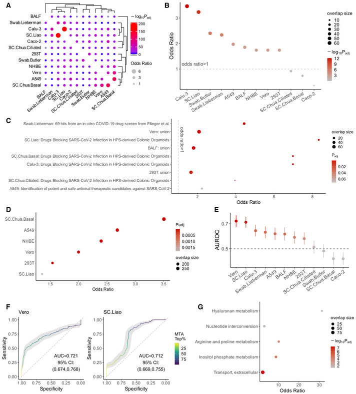
Figure 3. Genome‐scale metabolic modeling (GEM)‐based prediction of anti‐SARS‐CoV‐2 targets that act via reversing the virus‐induced metabolic alterations.

- Visualization of the overlap of the top 10% MTA‐predicted target reactions between each pair of datasets analyzed using Fisher's exact tests (Materials and Methods). The dot size corresponds to the effect size of the overlap as measured by odds ratio, and the color corresponds to the negative log10 adjusted one‐sided P value (gray means below 0.05).
- A summary visualization of the enrichment of the top 10% MTA‐predicted targets from each dataset for the antiviral hits (i.e., those whose KO inhibits SARS‐CoV‐2 infection) identified in the two published CRISPR‐Cas9 screens (Wei et al, 2021 and Daniloski et al, 2021; Materials and Methods). Y‐axis represents the odds ratio of enrichment, the dot color corresponds to the negative log10 adjusted one‐sided P value from Fisher's exact tests, and dot size corresponds to the number of enriched target reactions. The datasets are ordered by P values, the first eight datasets have FDR < 0.1.
- Cases of significant enrichment (FDR < 0.1) of top 10% MTA‐predicted targets from each dataset for the experimentally validated anti‐SARS‐CoV‐2 drug sets from previous studies (compiled by Kuleshov et al, 2020). “Union” means the union of all drug sets. Axes and the meanings of dot color and size are similar to (B), but the axes are flipped and the adjusted P values are not log‐transformed.
- Significant cases of significant enrichment (FDR < 0.1) of top 10% MTA‐predicted targets from each dataset for the host proteins involved in host‐SARS‐CoV‐2 protein–protein interactions (combined from preprint: Stukalov et al, 2020 and Gordon et al, 2020). Axes and the meanings of dot color and size are similar to (C).
- A summary of the area under ROC curve (AUROC) value of the MTA prediction using each dataset, based on positive and negative sets (i.e., genes whose KO inhibits or promotes the viral infection, respectively) from the two published CRISPR‐Cas9 screen data (Wei et al, 2021 and Daniloski et al, 2021; Materials and Methods). The error bars (vertical lines through the dots) represent 95% confidence intervals obtained with bootstrapping. The horizontal dashed line corresponds to AUROC of 0.5 (i.e., performance of a random predictor).
- Example ROC curves from two of the best‐performing datasets, one in vitro (Vero) and one in vivo (SC.Liao). The curves are colored by color gradients corresponding to the threshold of top MTA predictions.
- Summary of the metabolic pathways significantly enriched (FDR < 0.1) by the final list of consensus candidate targets identified across datasets (Materials and Methods). The axes and the meanings of dot color and size are similar to (B) except that the axes are flipped.
