
Figure 3. Bait–bait correlation analysis reveals molecular function clusters.
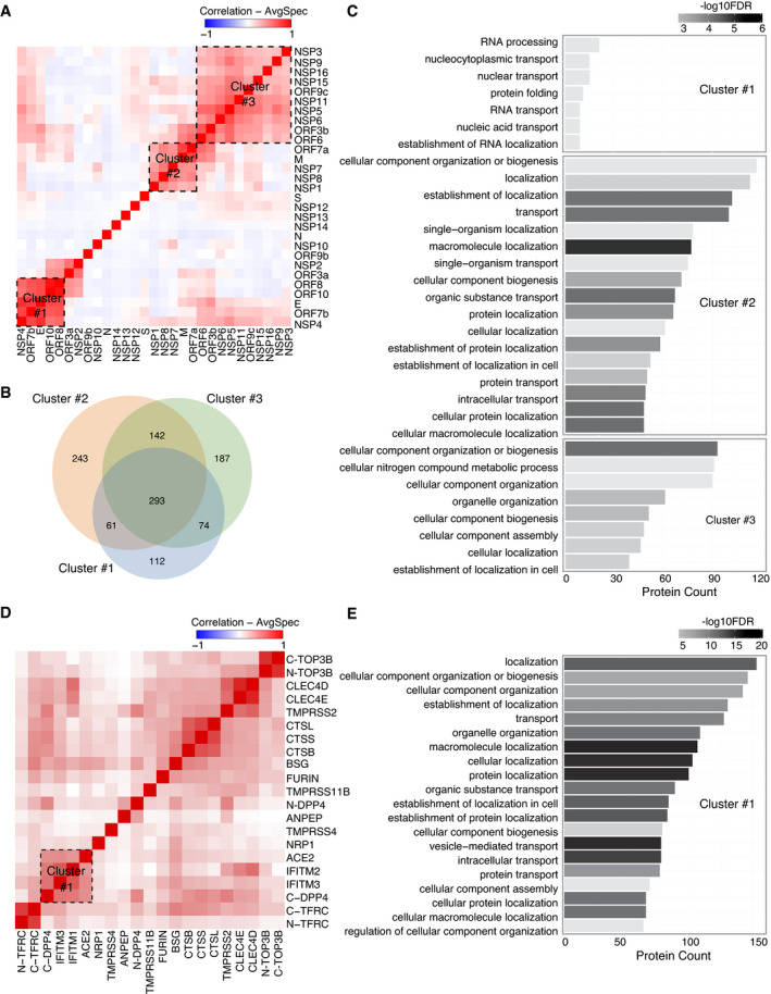
The correlation analysis (Pearson correlation coefficient) of bait–bait interaction profiles was performed based on average spectral counts (AvgSpec) (Liu et al, 2010) and visualized via a hierarchical clustering heatmap. Direct PPIs connecting bait proteins that form clusters on the heatmap are highlighted for several clusters.
-
AViral bait–bait correlation.
-
BThe overlap of proteins in each cluster is shown in a Venn diagram.
-
CA bar diagram of the enriched pathways associated with the clusters shown and ranked by P‐value.
-
DHost–receptor bait–bait correlation; the N‐ and C‐terminal tags on the same bait are indicated.
-
EThe bar chart represents the association of cluster 1 with specific pathways.