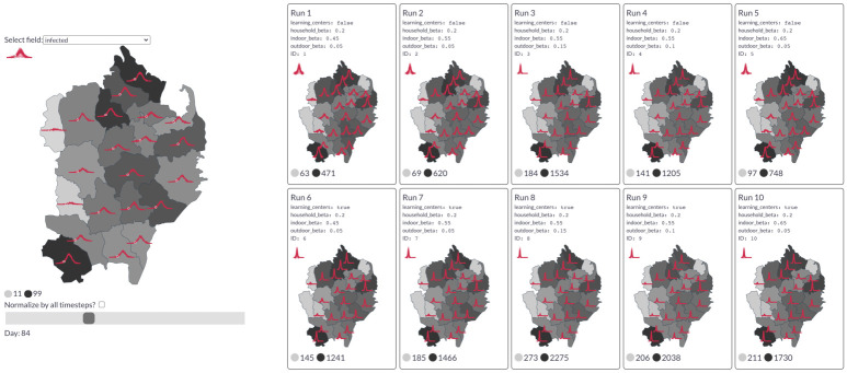
Fig 4.
Left: An example from the dashboard showing daily infections by region for a single simulation. The red sparklines indicate the trend over the course of the whole simulation. The slider position marks 84 days after the start of simulation (i.e., the current time step). Darker regions indicate a higher infection count at this point in time. Right: Comparison of the daily infection rate of each region across 10 simulations of the “learning centers” scenario, colored by the peak infection rate seen in each region. Basemaps from [23].

