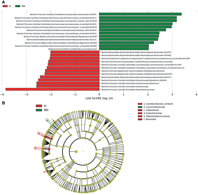
Figure 4.
LDA score (A) and evolutionary diagram (B), with circles representing taxonomic levels from phylum to genus/species. Each small circle at a different classification level represents a classification at that level, and the diameter of the small circle is proportional to the relative abundance. The species with no significant difference were yellow, while the differential species were colored as indicated.

