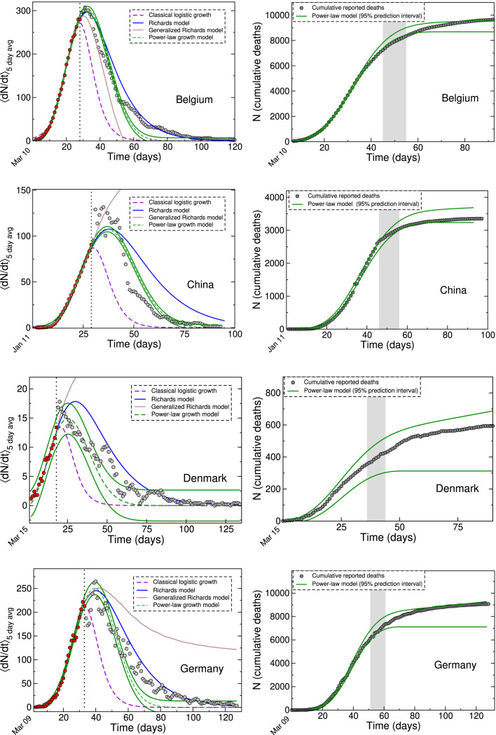
Fig. 2.
Left panel: Various LGM fits to the daily death data from Belgium, China, Denmark and Germany, shown together with 95% prediction intervals for the power-law model. The data points are the same as shown in Fig. 1 and correspond to the first waves in 2020. The red filled circles represent the ‘in-sample’ calibration points used to test the forecasting ability of each LGM. Right panel: Cumulative data shown together with 95% prediction intervals from power-law growth model fits. The gray band shows the approximate date range when the curves begin to flatten out. In each case, the date of the first reported death (day 1) is indicated at on the time axis. (For interpretation of the references to color in this figure, the reader is referred to the web version of this article).

