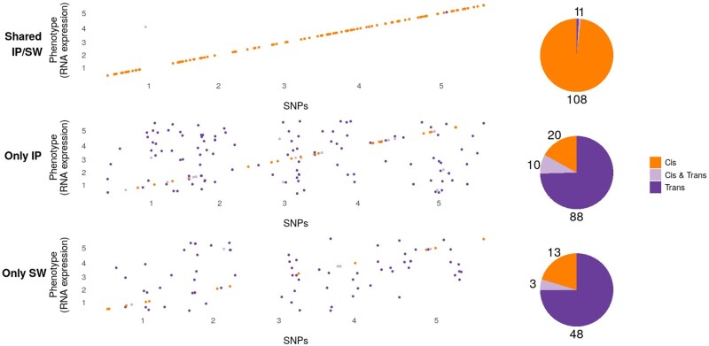
Fig. 4.
Summary of the difference between shared and nonshared GWAS results for expression data. The top panel shows associations that are shared between the two subpopulations, whereas the bottom panels show associations that are specific to one subpopulation. The plots show the chromosomal location of the genes whose expression is mapped on the x axis, and the chromosomal position of significantly associated SNPs on the y axis. Associations in cis are shown in orange, whereas trans-associations are shown in purple. The pie charts show the number of genes in each category.

