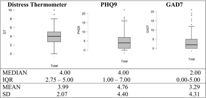
FIGURE 2.

Box plots of data from Distress Thermometer, PHQ‐9 and GAD‐7 tests. The boundary of the box closest to zero indicates the 25th percentile, a black line within the box marks the median, and the boundary of the box farthest from zero indicates the 75th percentile. Whiskers above and below the box indicate the 10th and 90th percentiles. Points above and below the whiskers indicate outliers outside the 10th and 90th percentiles. Text above each box plot indicates the corresponding tests. Median, IQR (interquantile range), mean, and SD (standard deviation) are presented at the bottom outside the graph
