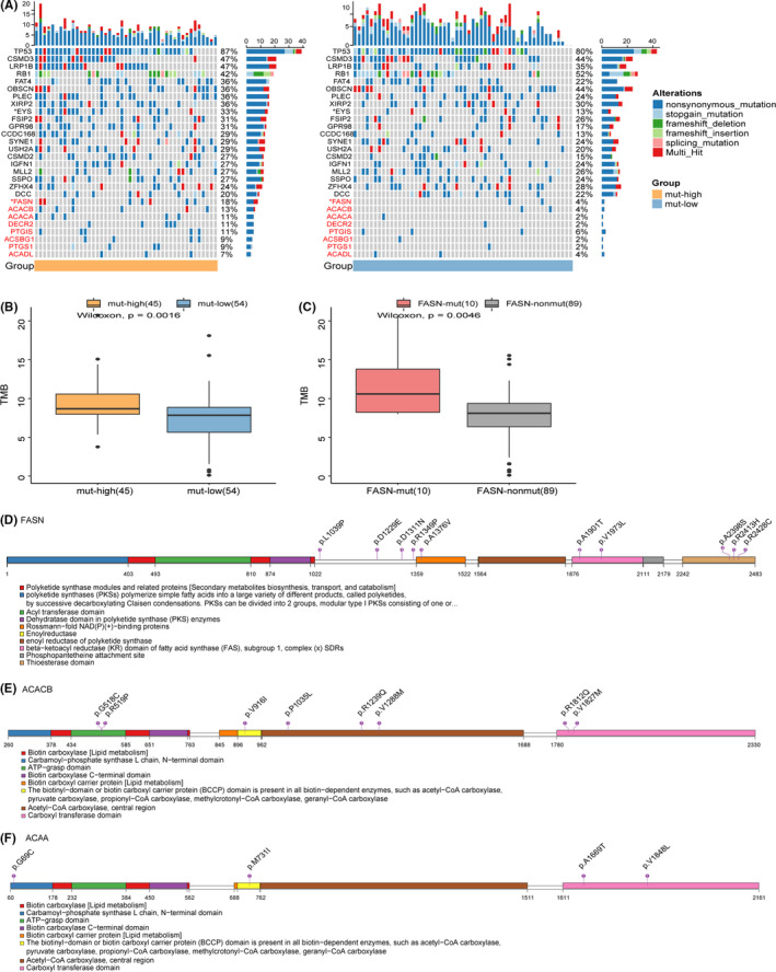
FIGURE 3.

The landscape of genomic alterations and lollipop charts of FASN mutation sites in Jiang's cohort. (A) Mutation profile of the top 20 currently mutated genes and genes in FA metabolism with overall mutation frequency >5% in 99 SCLC samples from Jiang's cohort, grouped by the frequency of mutations in the FA metabolism pathway. The gene symbols are marked on the left side: the symbols of genes in black font color are the top 20 mutated genes, and the symbols of genes in red font color are genes in the FA metabolism pathway. Asterisks indicate the relationship between the mut‐high/mut‐low groups, and those mutated genes were tested using the Fisher's exact test. ****p < 0.0001, ***p < 0.001, **p < 0.01, *p < 0.05. (B) The TMB in the mut‐high group was significantly higher than that in the mut‐low group. The values of the TMB are plotted on a log scale. (C) The TMB of the patients with mutated FASN was significantly higher than that of patients without mutated FASN. The values for TMB are plotted on a log scale. (D–F) Amino acid positions of FASN, ACACB, and ACACA mutations. Numbers in circles represent the frequency of the corresponding site mutation
