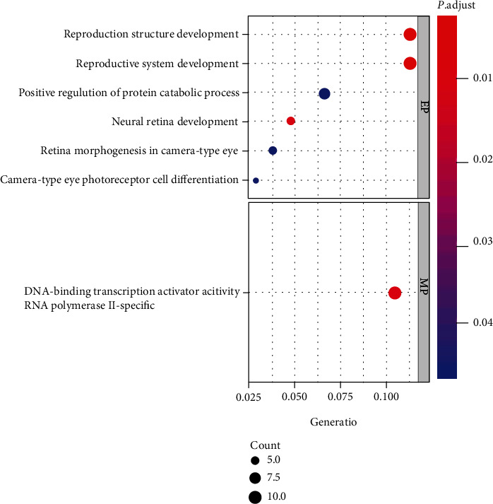
Figure 4.

Bubble chart of GO enrichment. Horizontal axis: the proportion of genes; vertical axis: enrichment items. The color of the point corresponds to the value of p adjust, while the size of the point corresponds to the number of DGEs under the GO entry.
