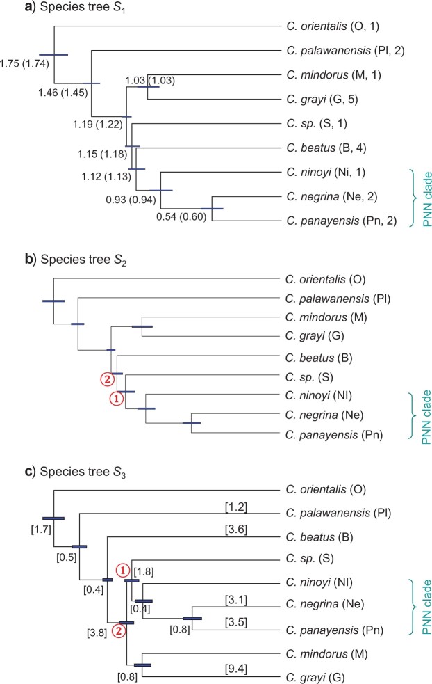
Figure 8.
a) The MAP species tree (also the majority-rule consensus species tree) produced in
the BPP analysis of the simulated dataset Sim1-Matching of Giarla and Esselstyn (2015). Posterior probabilities for nodes are
shown as percentages, whereas those not shown are 100%. Branches are drawn to reflect
the posterior means of the node ages ( s), which are shown
next to the nodes (with the true values in parentheses,
  ), whereas the node bars
indicate the 95% highest posterior density (HPD) intervals. The number of sequences
per species per locus is in the parentheses after each species name. This tree is also
the species tree that Giarla and Esselstyn
(2015) inferred from the UCE data and is the true species tree used to
generate the three simulated datasets (Sim1, Sim2, and Sim3x). b) and c) Two
alternative species trees (
 and
and  ) with
high posterior probabilities in the BPP analysis of the UCE dataset.
 appears to be the MAP tree, and the
posterior means of
  s for modern and ancestral
populations on
  are shown in square brackets
(
 ). The 95% HPD intervals of
node ages in
  and
and  , shown
as node bars, are shorter than those in
  , probably because
there are 919 loci in the UCE dataset and 500 in Sim1. Note that
 and
and  differ
by an NNI move around node 1, whereas
  and
and
 differ by another NNI move around
node 2.

