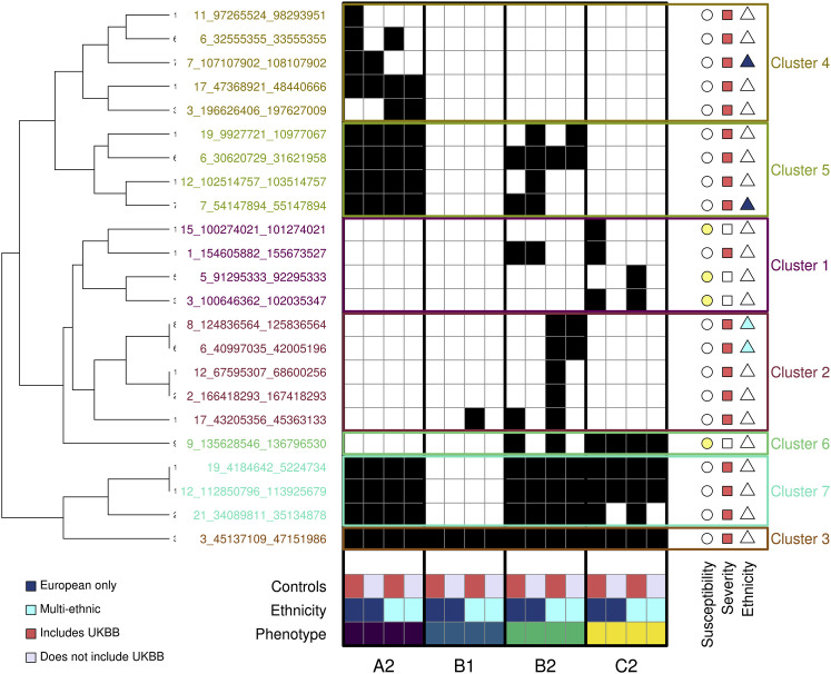
Figure 1.
GWAS signals across four COVID-19 phenotypes
Heatmap showing, for each of the 23 COVID-19 loci, the studies with p values < 1 × 10⁻⁷ (black squares). The 16 studies are sorted by phenotype (A2, B1, B2, C2), ethnicity (dark blue is for European only, cyan is for multi-ethnic), and type of controls (red indicates studies that included UK Biobank [UKBB] individuals as controls, while gray indicates studies that excluded UKBB individuals). The symbols on the right of each locus indicate whether each locus is associated with susceptibility (yellow circle) or severity (red square) or is ethnicity specific (European only, dark blue triangle; multi-ethnic, cyan triangle). Hierarchical clustering was performed using the hclust and cutree functions in R.

