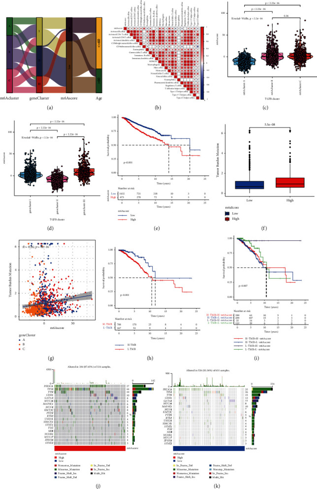
Figure 6.

Construction of m6A gene signature and exploration of its clinical significance. (a) Alluvial diagram showing the changes in m6Aclusters, gene clusters, m6Ascore, and survival status. (b) Correlation between m6Ascore and immune cells based on Spearman analysis. Blue and red indicate negative and positive correlations, respectively. (c) Kruskal–Wallis test was used to compare the difference in the m6Ascore between three different m6A modification patterns. (d) Kruskal–Wallis test was used to compare m6Ascore differences between three different m6A gene clusters. (e) Kaplan–Meier curve was used to analyze the survival of patients in the high- and low-m6Ascore groups. Patients in the low-m6Ascore group showed better survival outcomes. (f) Tumor mutation burden between different m6Ascore groups. (g) m6Ascore and tumor mutation burden (TMB) were negatively correlated (R = 0.26, P = 8e−16). (h) Kaplan–Meier curve was used to analyze patient survival results between high- and low-TMB groups. (i) Kaplan–Meier curve was used to analyze the survival of patients in the subgroup of m6Ascore and TMB. In both the high- and low-m6Ascore groups, patients in the low-TMB group showed a significant survival advantage. Tumor somatic mutation waterfall chart established from patients with high and low m6Ascores: (j) high-m6Ascore group and (k) low-m6Ascore group. Each upper bar graph shows the TMB, and the number on the right represents the mutation frequency of each gene. The columns represent individual patients.
