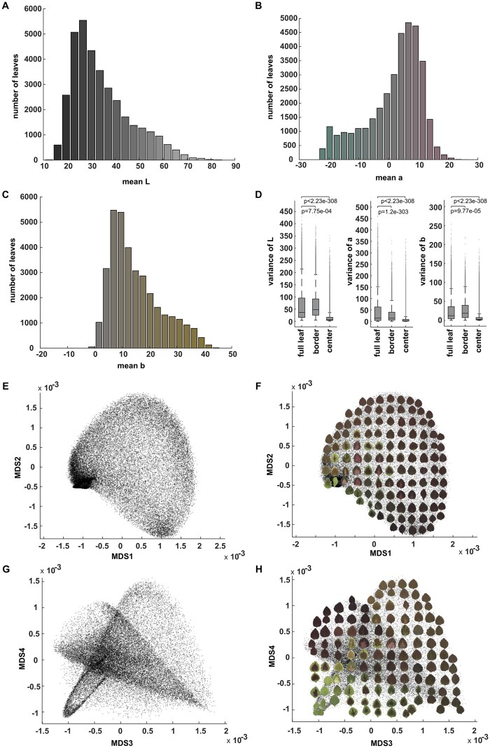
Figure 2.
CIELAB (L*a*b*) color distribution. A, The histogram of mean L (lightness) values of the studied coleus population. The color for each bar corresponds to the Lab color with L value at x axis, a = 0 and b = 0. B, Histogram of mean a (green to magenta) values. The color for each bar corresponds to the Lab color with a value at x axis, L = 50 and b = 0. C, Histogram of mean b (blue to yellow) values. The color for each bar corresponds to the Lab color with b value at x axis, L = 50 and a = 0. D, Boxplot of the variance of L, a, and b for full leaf, border, and center. The “+” signs mark outliers that are more than 1.5 interquartile ranges above the upper quartile or below the lower quartile for each box, the central line indicates the median, top and bottom edges of the box indicate 25th and 75th percentiles. Whiskers extend to the most extreme non-outliers of the data. P-values for full leaf versus border, full leaf versus center are also shown using paired sample Levene’s test to show the variances of the distribution are significantly different, E and G. MDS plot (MDS1 vs MDS2 in (E) and MDS3 vs MDS4 in (G)) for the pattern difference defined by the difference of Gaussian density estimator in 3D Lab colorspace across the full leaf, border, and center, F, and (H) The same MDS plots shown in (E) and (G) but with example leaves superimposed to provide visual examples of the data distribution.

