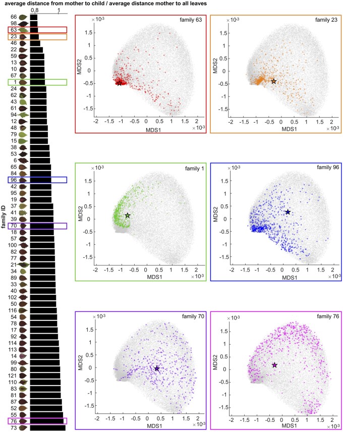
Figure 3.
Maternal Plant-Progeny relationships. On the left panel, each bar shows the average distance from maternal plants to progeny divided by the average distance from maternal plants to all leaves (x-axis) for each progeny family (y-axis) superimposed upon the scan of the maternal plant. On the right panels, there are six MDS plots (MDS1 vs MDS2) from six progeny families as examples with different colors correspond to the families highlighted in the same colored rectangles on the left panel. On each MDS plot, grey dots show all leaves, colored stars represent the maternal plants, and colored dots are the progeny.

