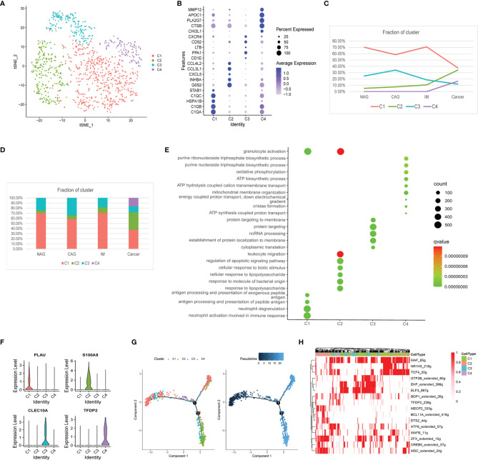
Figure 2.
Changes in the composition of macrophages, gene expression, and functions at different stages. (A) tSNE plot of the four macrophage subclusters. (B) A bubble plot of the top five markers of each cell cluster; dot size represents abundance while the color represents expression level. (C) Line chart showing the trend of the proportion of the four clusters across the four stages. (D) Stacked histogram showing macrophage composition across the four stages. (E) Bubble plot showing the biological function of different cell clusters using GO; dot sizes represent abundance while the color represents q values. (F) Violin plots of marker genes in the four subclusters. (G) The differentiation trajectory of macrophages. Sections are color coded for pseudotime (right) and clusters (left). (H) AUC scores of TF expression regulation using SCENIC. Results converted to binary data were visualized as heatmap plots constructed using the pheatmap function of R.

