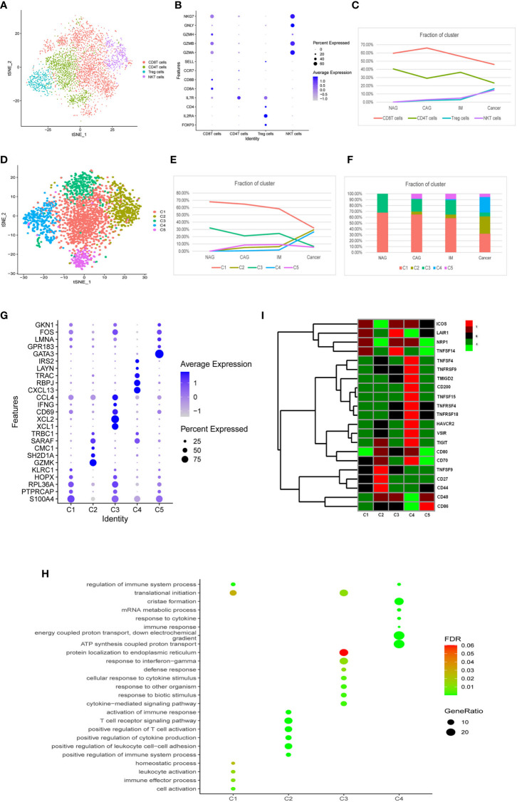
Figure 3.
Characterization of multiple changes in T cell subtypes at different stages. (A) tSNE plots of 4,553 T cells, 2,410 CD8+T cells, 1,213 CD4+T cells, 478 Treg cells, and 452 NKT cells. Colors indicate cell type. (B) A bubble plot of markers of each cell type; dot sizes represent abundance while the color represents expression levels. (C) Line chart showing changing trend of the proportion of the four cell types across the four stages. (D) A tSNE plot of the five CD8+T cell subclusters. (E) Stacked histogram showing CD8+T composition across the four stages. (F) Line chart displaying changing trend of the proportion of the five clusters across the four stages. (G) Bubble plot of top five markers of CD8+ T cell clusters; dot sizes represent abundance while colors represent expression levels. (H) A bubble plot showing the biological functions of different cell clusters using GO. Dot sizes represent abundance while colors represent q values. (I) Heatmap of immune checkpoints altered during the differentiation process of CD8+T cells, which was clustered into five clusters. A row Z score was used to represent expression levels.

