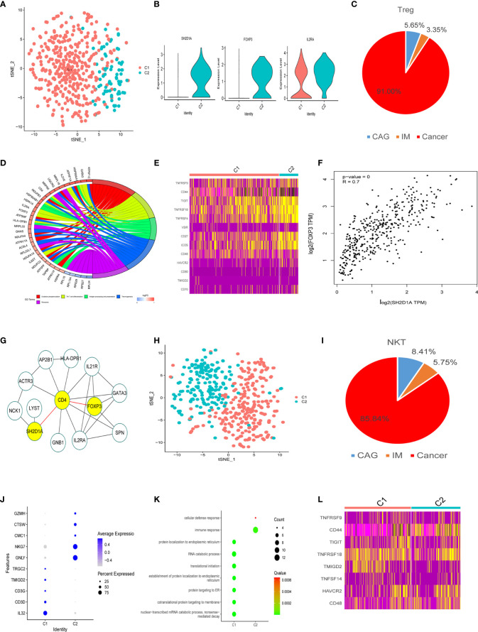
Figure 4.
Treg and NKT cell clusters. (A) tSNE plot of two Treg cell subclusters. (B) Violin plots of marker genes for the C2 cluster. (C) A pie chart representing Treg cells from different pathological stages. (D) Circle diagram showing the functions of different cell clusters using GO, colors represent different functions, brighter colors indicate high expression. (E) Heatmap of immune checkpoints altered during the differentiation process of Treg cells. (F) GEPIA was used to assess the correlation of two genes based on the TCGA database. (G) STRING database was used to analyze protein interaction networks, while Cytoscape was used to visualize these networks. (H) tSNE plot of two NK cell subclusters. (I) Pie chart representing NK cells from different pathological stages. (J) Bubble plot of the top five markers in NK cell clusters; dot sizes represent abundance while colors represent expression levels. (K) Bubble plot showing the biological functions of different cell clusters using GO; dot sizes represent abundance while colors represent q values. (L) Heatmap of immune checkpoints altered during NK cell differentiation processes.

