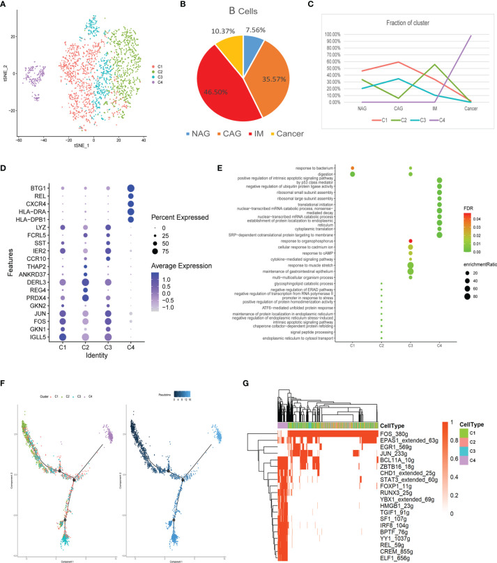
Figure 5.
Characterization of multiple changes in B cell subtypes at different stages (A) tSNE plot of four B cell subclusters. (B) Pie chart representing B cells from different pathological stages. (C) Line chart displaying changing trend of the proportion of the four cell types across the four stages. (D) Bubble plot of the top five markers of each cell cluster; dot sizes represent abundance while colors represent expression levels. (E) Bubble plot showing the biological functions of different cell clusters using GO; dot sizes represent abundance while colors represent q values. (F) B cell differentiation trajectory in the four stages, with each color coded for pseudotime (right) and clusters (left). (G) AUC scores of transcription factor expression regulation using SCENIC. Results converted to binary data were visualized as heatmap plots constructed using the pheatmap function of R.

