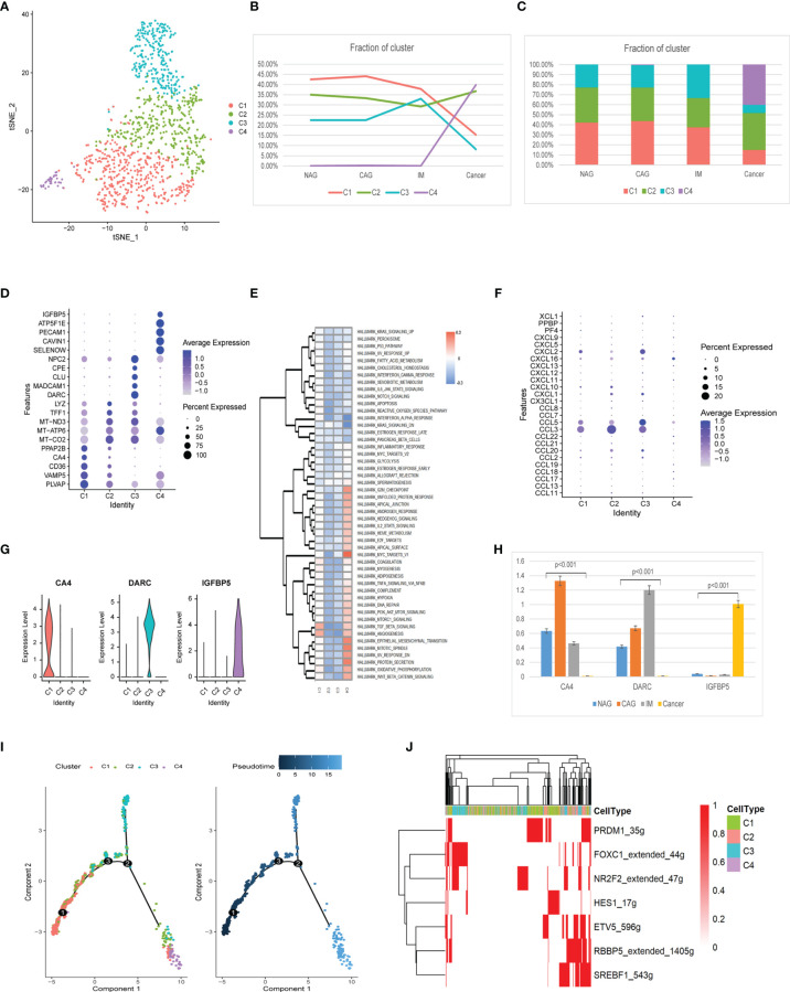
Figure 7.
Identification of endothelial cell clusters and expression features at different stages. (A) tSNE plot of the four endothelial cell subclusters. (B) Line chart displaying changing trend of the proportion of the four cell types across the four stages. (C) Stacked histogram showing endothelium composition across the four stages. (D) Bubble plot of the top five markers of each cell cluster; dot sizes represent abundance while colors represent expression levels. (E) Heatmap showing activity differences in 50 hallmark pathways scored by GSVA. T values are calculated using a linear model. (F) Bubble plot showing scale normalized expression of representative genes involved in chemokine processes. (G) Violin plots of marker genes for the five subclusters. (H) Histograms of scale normalized expression levels of three marker genes at each stage. (I) Endothelial cell differentiation trajectory, with each color coded for pseudotime (right) and clusters (left). (J) AUC scores of TF expression regulation using SCENIC. Results converted to binary data were visualized as heatmap plots constructed using the pheatmap function of R.

