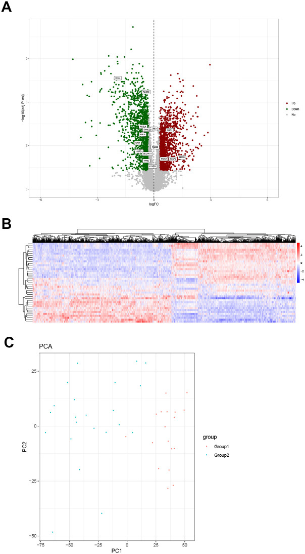
Fig 4. Differential gene expression analysis diagram and principal component analysis.
(A) Volcano map. The green dots, down-regulated differential genes; the red dots, up-regulated differential genes; the gray dots, genes that are not differentially expressed. Sixteen of the iron death genes are among the differentially expressed genes. (B) Heat map of differential gene expression. The abscissa represents gene clustering. The more the genes are expressed in the same amount in the sample, the closer they are in the figure. The ordinate represents the clustering of samples. The more the gene expression levels are the same among samples, the closer they are in the picture. The color scale represents the abundance of gene expression. The red presents up-regulation and the blue presents the down-regulation. (C) Principal component analysis based on differentially expressed genes.

