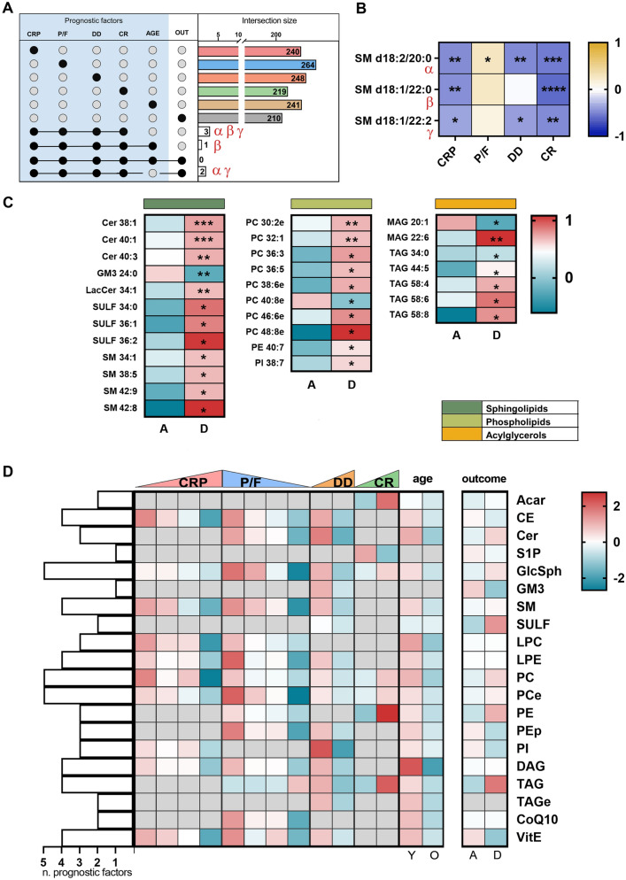
Figure 5.
In (A) and (B), intersection size graph and Pearson correlation of lipids commons in the selected prognostic factors and outcome. (C) Heatmap of lipids associated uniquely with death. In (D), the heatmaps on the left show the lipid classes perturbed by the severity of the disease according to five prognostic factors. Those on the right report the alteration of the lipid according to the outcome. A grey square denotes no significant alteration of that class in that prognostic factor. On the left side, the bars indicate the number of the prognostic factors each lipid class is involved in.

