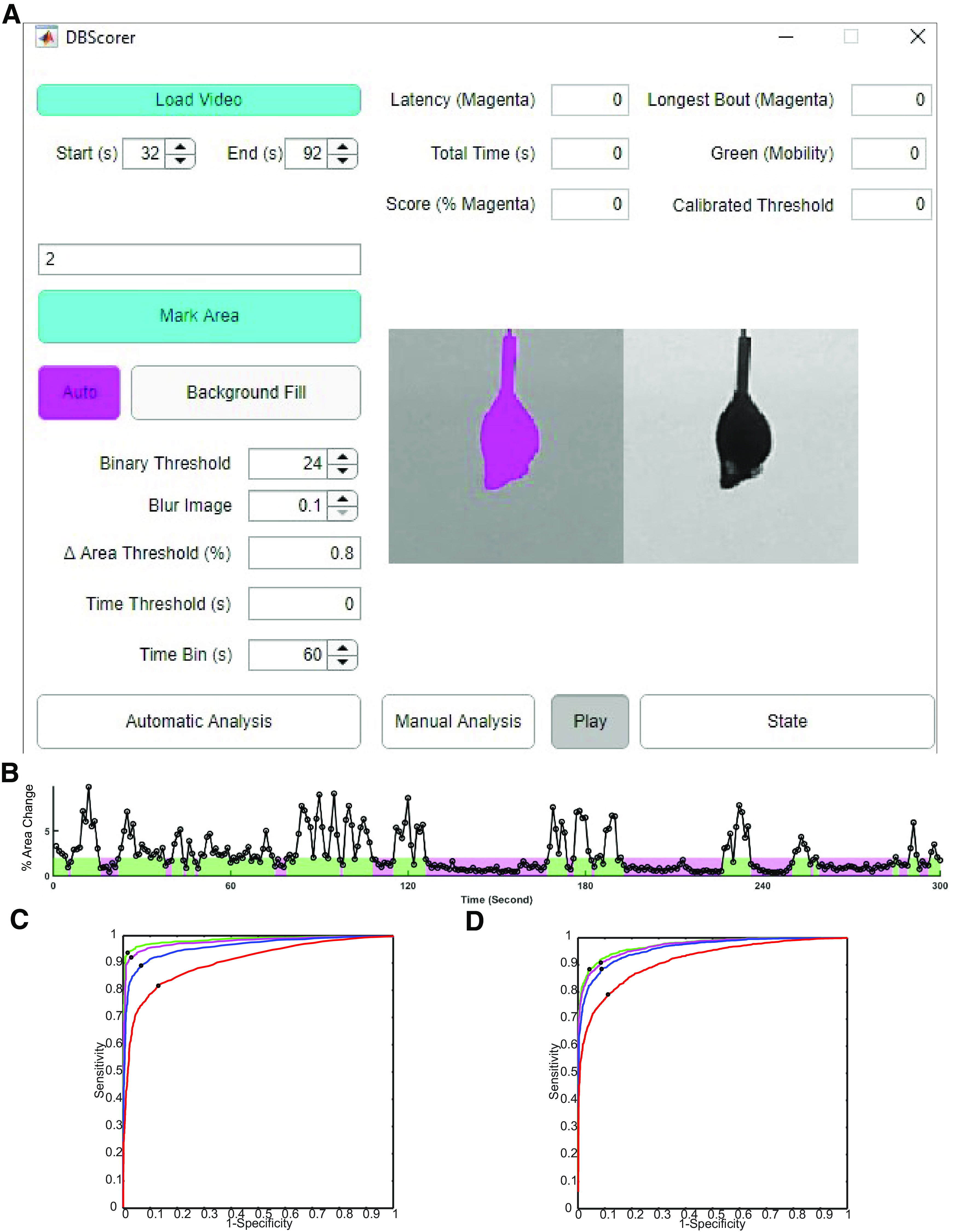
Figure 1.

Development of DBscorer and the GUI and the estimation of optimum threshold. A, Screenshot of the DBscorer user interface showing a TST video loaded for analysis. B, The representative line plot shows the % change in the area as a function of time. Epochs of immobility are shown in magenta and epochs of mobility are depicted in green based on the optimized threshold. ROC curves for (C) TST and for (D) FST with 0 s (red), 1 s (blue), 2 s (magenta), or 3 s (green) removed from the behavioral state transitions. Sensitivity values at the optimum thresholds are shown by black dots for each ROC curve.
