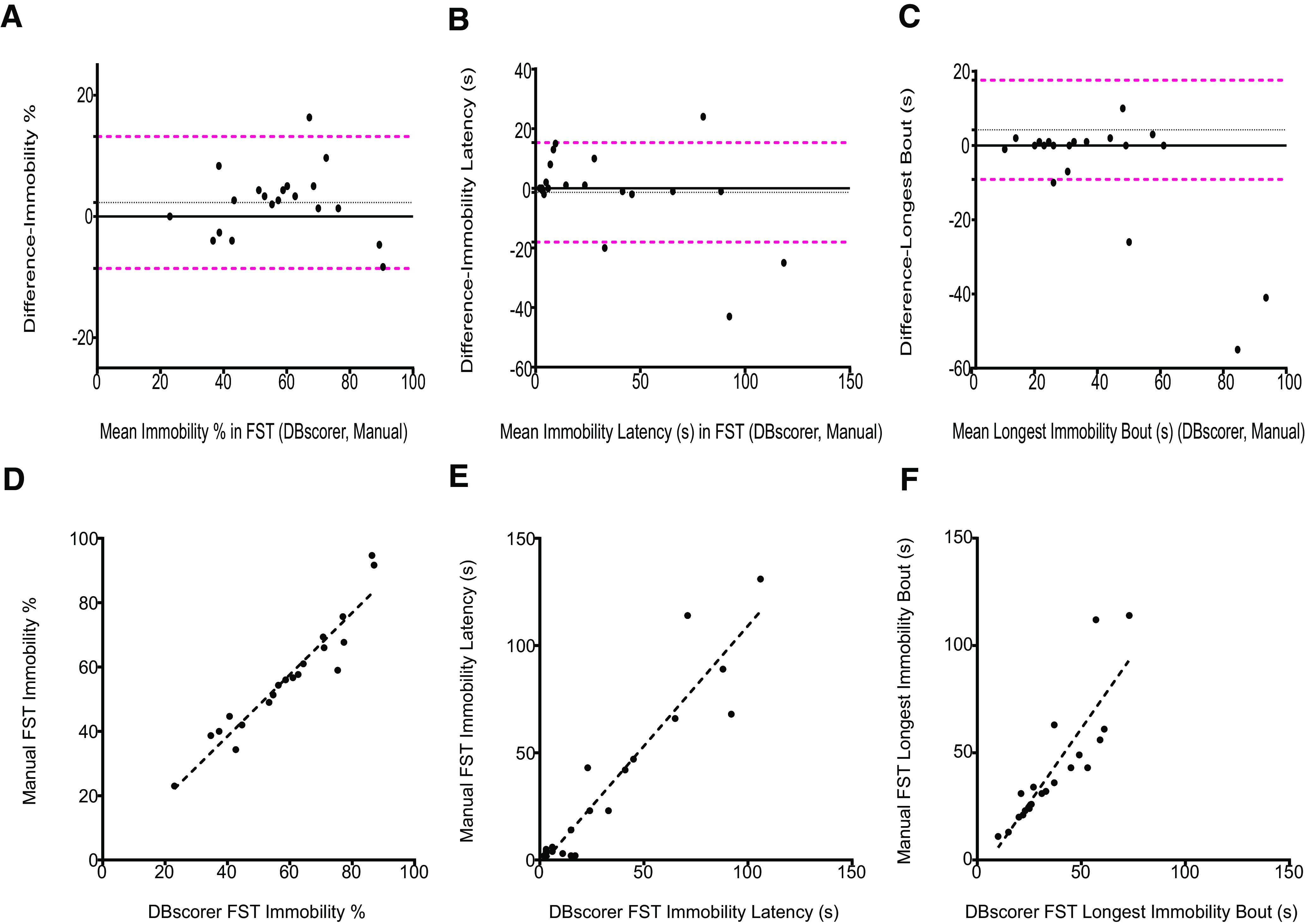
Figure 3.

Comparison of automated analysis with DBscorer against manual analysis in the FST. Bland–Altman plots for FST are plotted using the data obtained from DBscorer and with manual analysis for (A) % time spent immobile, (B) latency to the first bout of immobility (seconds), and (C) the duration of the longest bout of immobility (seconds). Black solid line at zero depicts complete agreement between the two methods. Dotted black line denotes the mean. Dotted magenta lines depict 1.96 SDs (95% limits of agreement) away from the mean. Scatter plots with an overlaid linear fit showing the correlation between the manually obtained data with the data obtained from DBscorer for (D) % time spent immobile, (E) latency to the first bout of immobility (seconds), and (F) the duration of the longest bout of immobility (seconds). Pearson’s correlation coefficient and p value were used to determine the correlation; n = 20 videos.
