Figure 4.

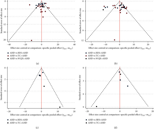
Comparison-adjusted funnel plots. The points of different colors represent a direct comparison of two interventions: (a) SBP; (b) DBP; (c) NO; and (d) ET.

Comparison-adjusted funnel plots. The points of different colors represent a direct comparison of two interventions: (a) SBP; (b) DBP; (c) NO; and (d) ET.