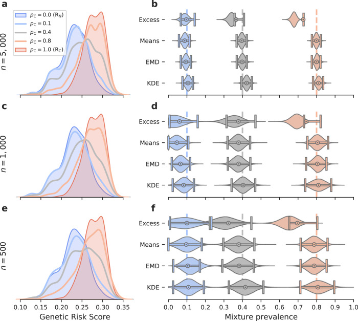
Fig. 2. A comparison of the four methods prevalence estimates and confidence intervals for varying proportion of cases and for three sample sizes.
Mixture distributions of non-cases and T1D patients from WTCCC8 were constructed with (shown in blue, grey and red respectively) and (shown in panels (e–f), (c–d), (a–b) respectively). a, c, e The constructed mixture distributions and reference distributions (, shaded red and , shaded blue) from which they were constructed. b, d, f Prevalence estimates, (bullseye) obtained by each of the four methods for varying (x-axis) and cohort size, (rows). Each estimated value is shown together with a violin plot illustrating the distribution of the 100,000 estimates of prevalence () in the bootstrap samples and with confidence intervals () shown as horizontal lines with vertical bars at the ends. Dashed vertical lines indicate reference prevalence values . In all the cases, for the Excess method we observe a large offset between the violin plots (including confidence intervals) and the value. This offset is a result of the systematic bias of the Excess method. The other three methods generally show much less bias. Sample sizes: – cases WTCCC T1D (), – non-cases WTCCC T2D (), mixtures – sampled with replacement from a holdout half of the () and () samples.

