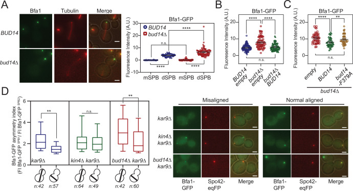
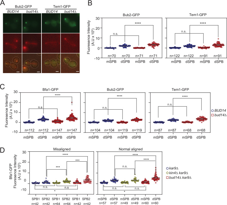
Figure 6. More Bfa1 localizes to daughter spindle pole body (dSPB) in the absence of BUD14.
(A) Bfa1-GFP signal intensity quantifications at the SPBs of BFA1-GFP mCherry-TUB1 or BFA1-GFP mCherry-TUB1 bud14∆ cells with normal aligned anaphase spindles were plotted on the right. Black and gray lines in the dotplots are the mean value and standard deviation, respectively. Representative still images of cells are shown on the left. (B) Bfa1-GFP signal intensities at the dSPB were plotted in BUD14 and bud14∆ cells bearing empty plasmid (blue and red), as well as bud14∆ cells bearing a ADH-BUD14-containing plasmid (green). (C) Bfa1-GFP signal intensities at the dSPB were plotted in bud14∆ cells bearing empty plasmid (red), ADH1-BUD14-containing plasmid (green) and ADH1-bud14-F379A-containing plasmid (yellow) (D) Analysis of Bfa1-GFP asymmetry at the SPBs of kar9∆, kar9∆ kin4∆, and kar9∆ bud14∆ cells with correctly aligned and misaligned anaphase spindles. Box and Whisker plot shows the ratio of Bfa1-GFP signal intensities at the SPB1 and SPB2, where SPB1 always corresponds to SPB with the greater Bfa1-GFP signal. The box represents first and third quartile while the whiskers show 10–90 percentile of the data. The horizontal line in the box indicates the median of the data. Only comparisons of normal and misaligned spindles are shown in the figure. Representative still images of cells are shown on the right. n: sample size. Scale bar: 2 µm. One-way ANOVA with uncorrected Fisher’s LSD was applied for all statistical analyses. **p<0.01, ***p<0.001, ****p<0.0001. All pairwise comparisons are shown in the corresponding source data files.


