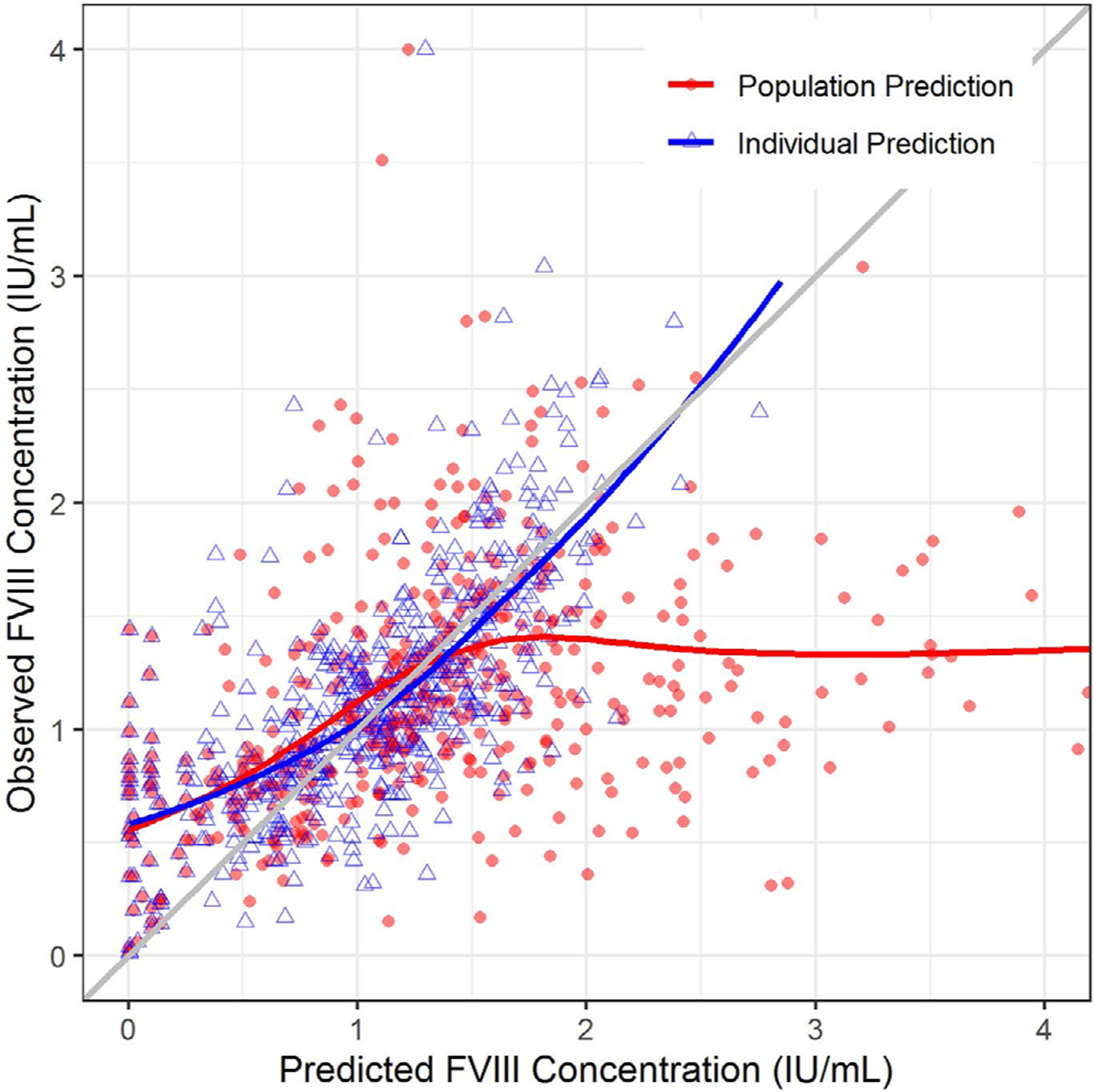
FIGURE 2.

Goodness of fit plot for the external validation. The plot depicts the observed FVIII concentrations (Y-axis) plotted against the model-predicted FVIII concentrations (X-axis). The red solid circles denote population predicted FVIII concentrations, whereas the blue triangles denote the individual predicted FVIII concentrations (which ideally match observed FVIII concentrations in University of North Carolina Medical Center patients). The red and blue lines represent the trend line for the population and individual predictions, respectively. The diagonal grey line represents the line of unity. FVIII, factor VIII
