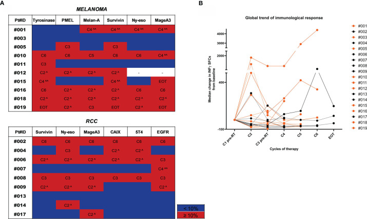
Figure 2.
Trend of immunological response to treatment. (A) Heatmaps highlighting the gradient of the immunological response to treatment represented as % of variation in the number of INF-γ SFCs for each TAA compared to baseline values. Patients are divided by tumor type (MM upper panel and RCC lower panel). For each tested TAA, immune responses ≥10% compared to baseline values are highlighted in red and the therapy cycle for which the best response was observed is reported. Immune responses <10% are shown in blue. (^ after the first RT cycle, ^^ after the second RT cycle). (B) The overall trend of the immunological response for each patient is shown in a spider plot (orange dots/line for MM and black dots/lines for RCC). Each dot represents the median variation in the number of INF-γ SFCs for each TAA, considering the baseline value as 0. Treatment cycles are indicated in the x axis.

