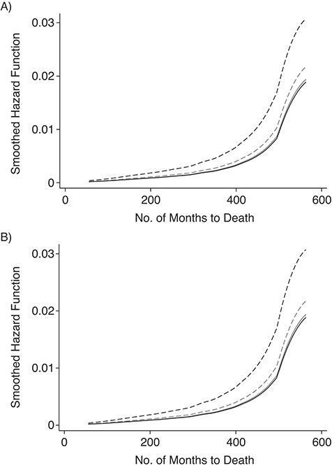
Figure 1.

Hazard curves by race predicting A) months to death, using the mean level of flourishing to distinguish high versus low flourishing; B) months to death using 1 standard deviation above the mean level of flourishing to distinguish high versus low flourishing. Data are from the Midlife in the United States Study, 1995–2016 (n = 2,851). Dashed light grey line, Whites with low flourishing; solid light grey line, Whites with high flourishing; dashed black line, Blacks with low flourishing; solid black line, Blacks with high flourishing.
