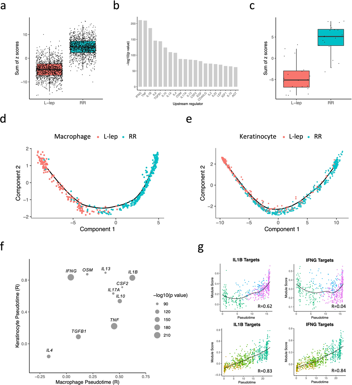
Fig. 4. Antimicrobial gene analysis and pseudotime construction.

a. Boxplot showing the sum of 1,124 antimicrobial gene z scores in L-lep and RR cell types. The p value (< 2.2e-16) was calculated from a two-sided T test (n = 1,124). The bounds of the box represent the first and third quartile, the middle bar represents the median.
b. Bar graph showing the top 20 upstream regulators ranked by p value from the enrichment analysis using the 1,124 antimicrobial genes.
c. Boxplot showing the sum of the z scores for the top 20 upstream regulators in L-lep and RR cell types. The p value (3.5e-09) was calculated from a two-sided T test (n = 1,124). The bounds of the box represent the first and third quartile, the middle bar represents the median.
d. Pseudotime trajectory colored by clinical form in myeloid sub-cluster 2, 3 and 4.
e. Pseudotime trajectory colored by clinical form in keratinocyte sub-cluster 1, 2 and 3.
f. Dot plot showing the correlation between the module scores of the top 10 upstream regulators and macrophage/keratinocyte pseudotimes. The size of the dots represents the −log10(p value) from the enrichment analysis.
g. Scatter plot showing the correlation between macrophage (top) or keratinocyte (bottom) pseudotimes and module scores calculated using IL1B target genes or IFNG target genes from the six expression patterns. Color of the dots represents the sub-cluster identity of the cells.
