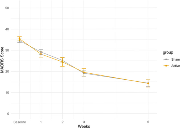
Fig. 2. Change in MADRS score over time.

Circles represent means in each group, bars represent ±1 standard deviation from the mean. In orange, participants using active-TBS; in gray participants using sham-TBS. The y-axis indicates the values of the MADRS score in the mITT sample. On the x-axis the values at each time of the assessment are indicated (baseline, first week, second week, third week, and sixth week).
