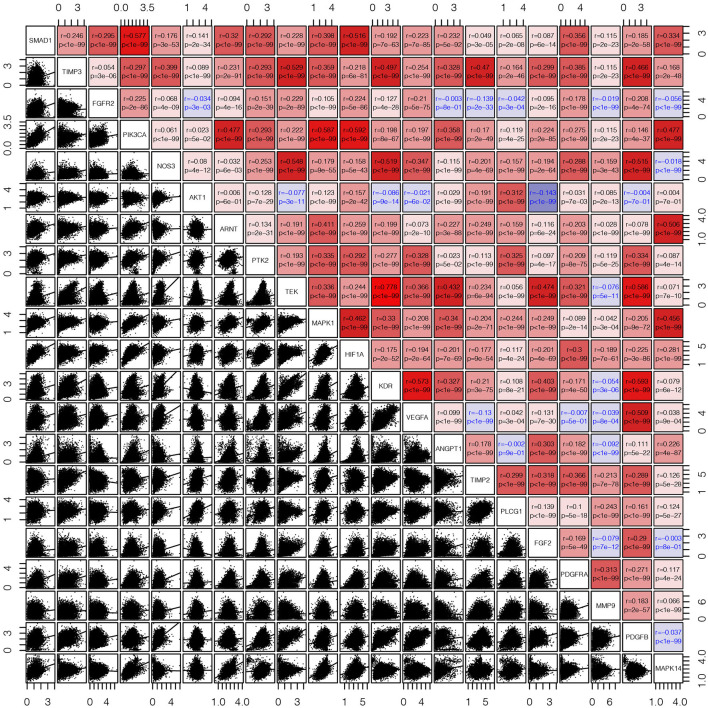
Figure 2.
The corrgram showed that there was a co-expression correlation between the angiogenesis pathway genes in pan-cancer. We used the “pair” function in the graphics R package to draw this picture. The gene expression data were normalized by log(1+x). The scatter plot and regression line are drawn in the lower-left panel. The corresponding genes are displayed on the diagonal, and the Pearson's correlation coefficient and the corresponding p-values are displayed in the upper right panel. The Pearson's correlation coefficient is projected to five colors, negative values are displayed in blue, and positive values are displayed in red.

