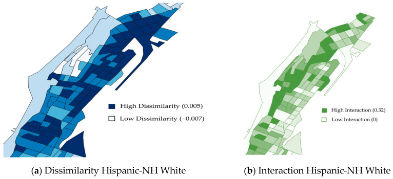
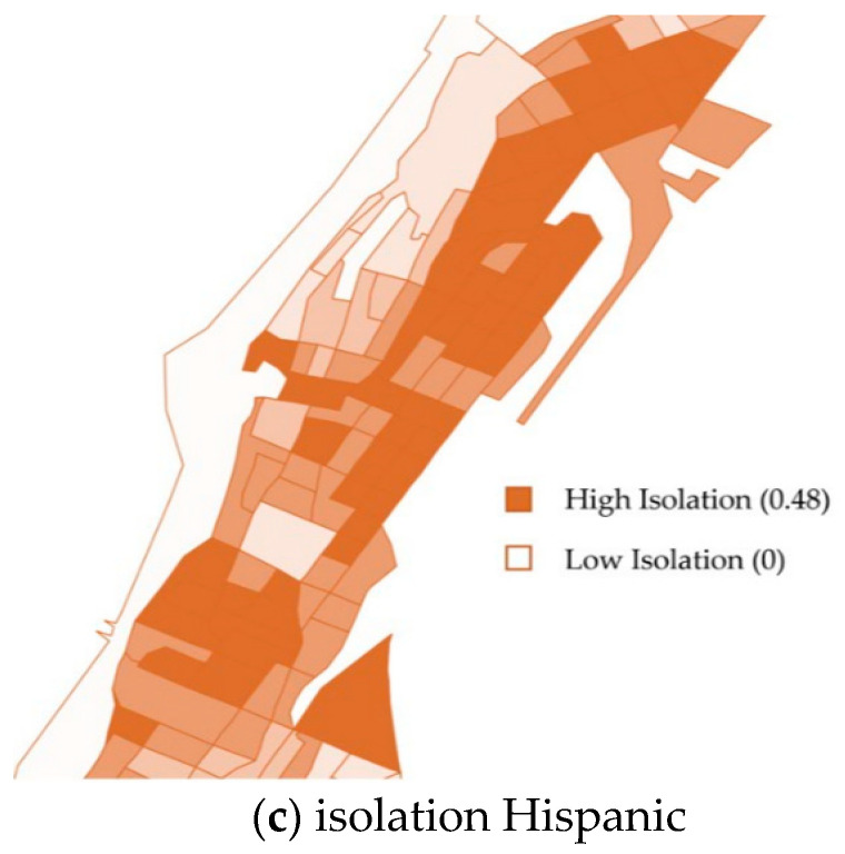
Figure 1.
This figure demonstrates the unique information provided by the three different racial residential segregation indices (dissimilarity, interaction, isolation) using the Hispanic group as an example. The maps above show the block groups for Washington Heights and Inwood, New York. (a) Dissimilarity index for people who are Hispanic and non-Hispanic White. Darker blue is higher dissimilarity; lighter blue is lower dissimilarity. (b) Interaction index for people who are Hispanic and non-Hispanic White. Darker green is higher interaction; lighter green is lower interaction. (c) Isolation index for people who are Hispanic. Darker orange is higher isolation; lighter orange is lower isolation. Maps for other 4 indices are provided in Supplementary Figure S3.


