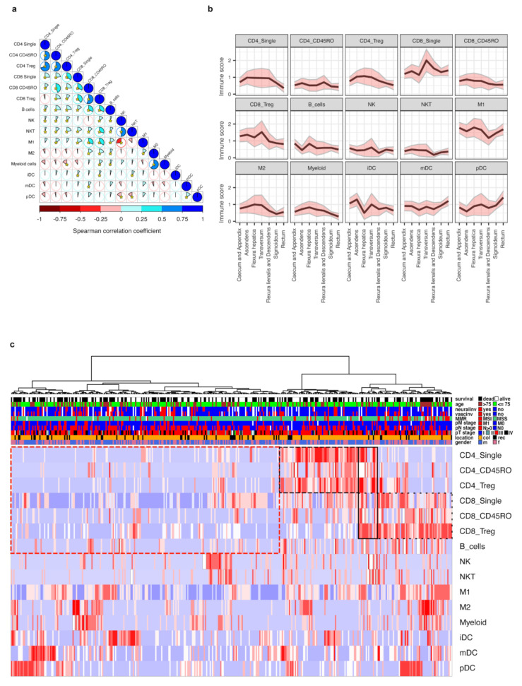
Figure 2.
The immune scores interrelations, distribution across different clinical and pathological groups and unsupervised hierarchical clustering. (a) Graphical representation of Spearman’s correlation matrix between immune scores. Pie charts and the intensity of shading represent the strength of correlation (Spearman correlation coefficient), blue color indicates direct while red color indicates inverse correlation. Asterisks indicate statistical significance (p < 0.05). (b) Immune scores mean levels (black line) and 95% confidence intervals (pink areas limited by gray lines) at specific primary tumor locations. For additional data, see Table S2. (c) Unsupervised hierarchical cluster analysis of immune scores. Cases were clustered based on the levels of immune scores. A total of 373 cases with complete immune score data from therapy-naïve patients were available. Clusters with enriched CD4 or CD8 cells are marked by dashed black line, while the cluster with low lymphocyte level is marked by dashed red line. For additional data, see Table S3.

