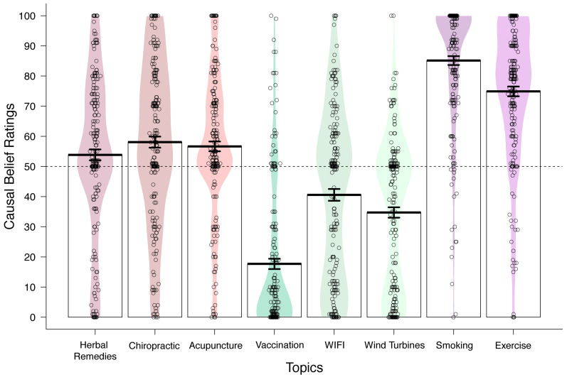
Figure 1.
Plot of the density of responses (n = 210) on the causal belief question for each target topic area grouped by belief type. Each circle represents a participant’s response, and the coloured region reflects the density of the responses along the Y-axis. Mean causal rating (±SE) across all respondents is denoted by a bold black line.

