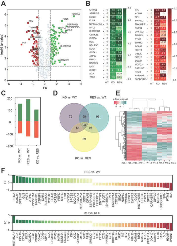
Figure 4.
Overview of differentially regulated proteins in pairwise comparison. (A) Volcano plot illustrates the differentially regulated proteins (related to gene names) in the reference comparison group between knockout (KO) and wild-type (WT). X-axis represents the log2-fold changes (FC) of LFQ intensities and y-axis –log10 (p values). Up- and downregulated proteins in KO are labelled in green and red squares. (B) Heat map showing the average log2 LFQ intensities of top 20 up- and downregulated proteins from reference (KO vs. WT) in comparison to rescue (RES). (C) Bar charts representing the number of significantly regulated proteins in pairwise comparison. (D) Venn diagram illustrates the distributions of the significantly altered proteins from the pairwise comparisons. (E) Hierarchical clustering of the significantly regulated proteins from the pairwise comparisons. Single LFQ intensities of proteins are clustered in rows and columns using centroid linkage method and Euclidian distance measurement technique. Z-Score was used to normalize the data. Upregulated and downregulated proteins are represented with red and green colors. (F) The expression levels of top 25 significantly (trimmed log2 FC of 5, p value < 0.05) up- and downregulated proteins in different pairwise comparison groups: RES vs. WT, KO vs. RES.

