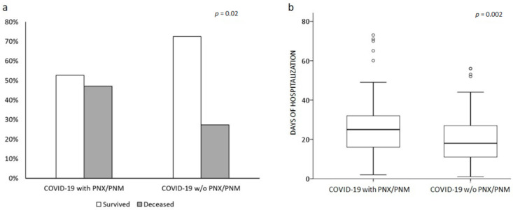
Figure 2.
Comparison between COVID-19 patients with and w/o PNX/PNM. Bar line graph (a) compared the different in-hospital mortality rates (light grey deceased, dark grey survived) between the two groups. Box plot graph (b) compared the different lengths of hospitalization in the two groups. Solid line represents the median; bottom and top of the boxes are the 25th and 75th percentiles; brackets correspond to the 10th and the 90th percentiles.

